
KITCHEN DESIGN - BACKSPLASHES
.Why does everyone think the backsplash is the place to go wild in their kitchen? I don't get it...

Every new kitchen has one of three things on their backsplash: Glass 1/2" x 1/2" mosaic tiles, subway tile or tumbled-marble tiles.
I especially love those circa-1999 kitchens with tumbled marble backsplashes where people think they've created “an old world look" when they're used with high-polished granite counters and cherry wood "Shaker-style" cabinets...

I especially love those circa-1999 kitchens with tumbled marble backsplashes where people think they've created “an old world look" when they're used with high-polished granite counters and cherry wood "Shaker-style" cabinets...
While researching photos of backsplashes for this article it was actually hard to find images that didn’t have schmaltzy tile murals over the range with some heinous Tuscan Farm scene - or worse…

(Oh yeah, I definitely want a rabid raccoon hovering over my food while it cooks)
(Oh yeah, I definitely want a rabid raccoon hovering over my food while it cooks)
If you’ve ever read any missive from the MASTER CLASS you know I lean to the less-is-more side. When designing a kitchen every detail needs to be considered!
Metaphorically: Whatever is under consideration whilst designing the kitchen(or any room); backsplash, flooring, cabinetry, etc., should be considered as part of an entire “symphony” because you don’t want the violins to over-play the piano, or kettle-drums to drown out the harp… EVERYTHING in the entire room needs to play in perfect harmony.
If a backsplash is ornate or complicated it will draw attention to itself usurping everything else in the room. Also, don't forget you'll have the toaster, blender, phone, bread-maker, coffee pot, canisters, and all the other cutesy designer crap that sits in front of it... Why create a background to draw your eye to the clutter of small appliances and tsotchke's? Get it?
Lets begin with a tried and true classic design that is wayyyy overdone but still looks nice anyhow...
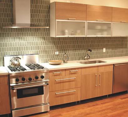
SUBWAY TILE

Subway tiles span the 19th, 20th and 21st centuries. It looks fine with most kitchens and comes in hundreds of colors, sizes, textures and variations.

The inset pattern over the range on the lower right side is simple, decorative and not too bold.
Who says it cant be installed vertically? It gives it a whole new contemporary look.
MARBLE & STONE SUBWAY TILE

A small notch up from ceramic subway tile, the marble can add a nice warmer tone and compliment the counter-top. Be careful using busily patterned marble or odd colored grout!
SOLID STONE SLAB
(My favorite, usually)
(My favorite, usually)

This beautiful Carrera marble is used on the backsplash and counter-tops; it's simple, easy to clean and looks amazing with any decor.

Soapstone; used here in a country-style kitchen looks so chic and simple, even sleek. It makes this country kitchen tres a jour.

This single slab of Calacatta Gold is absolutely stunning over this range. The subtly patterned marble is the decoration; much better than some schmaltzy tile extravaganza.

This granite top with matching backsplash is clean-lined, simple and more architectural looking.

Calacatta Gold counters and backsplashes look amazingly elegant in this "transitional" kitchen. Notice the top of the backsplash lines up with the bottom of the range hood and the mid-section of the double hung windows creating one circumferential linear element around the room.
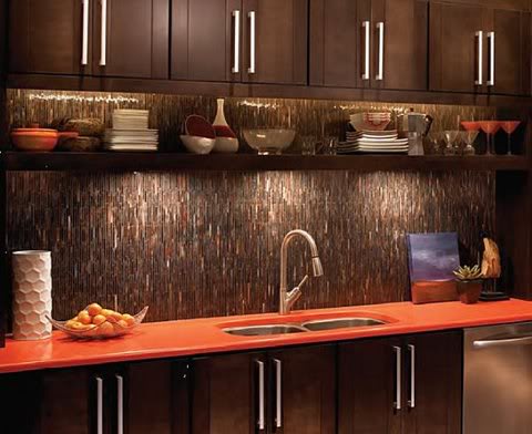
MARBLE & STONE MOSAIC


These slivers of stone are the new "new thing"
They're lovely and have such textural and subtle effects. However, I they're VERY hot right now; usually, I shy away from super-hot trends as they become dated looking more quickly than others.
GLASS TILES & MOSAICS


Talk about a "trend"...geesh...will it never end? Glass is beautiful and has cool depth and reflective qualities, but its sooo overused...

SOLID GLASS PANELS

Designer Juin Ho gives us a violet colored back-lit glass backsplash.
This stuff is the BOMB! This look is white-hot!!!
It can have a textured back or be back-painted (still smooth on the front so it's easy to clean) custom matched to any color you want. It can also be back-lit with different colors.


This backsplash above demonstrates how it can be back-lit with LED changeable colors too!
No way? Yes, wayyyy!
MOSAIC TILES
GLASS


The Bisazza type glass tiles above are sorta over-done now. You cant swing a cat without hitting a kitchen, bath or pool using 1/2" x 1/2" glass tile.
MARBLE

These mosaics are instant classics. Remember, highly patterned surfaces become tiring and dated looking quickly.
CERAMIC

Designer Eric Cohler used simple white ceramic mosaics in this sexy kitchen and it looks amazing!
MIRRORED BACKSPLASHES

A hot trend from the early 80's returns with a lotta flash for your cash.

Perfect for small kitchens, ones without windows or a bar. It reflects light and adds to the illusion of space. Note: Mirrored backsplashes need cleaning often as they show everything... every spot, spatter and imperfection....I'm just sayin' .
STAINLESS STEEL
OMG - Chic as shit, riiight?

The left column above is more my (flawless) taste as I think the ones in the right column are too schmancy and look like a flashy Rolex.

LOVE, LOVE, LOVE this kitchen above, It's small, lean and mean!
The high-gloss cabinets, stainless pulls, Calacatta tops and stainless appliances all harmonize with the "penny-tile" stainless backsplash.
CERAMIC TILE

This gets by on a the fact it's only two colors.... But dude, really, FOUR patterns?

They can be simple tiles used in simple ways...

Or, highly decorative tiles used in elaborate ways!
Ceramic is the tried-and-true material we've always come back to for centuries, whether it's a contemporary or old-world feeling we wish to achieve. From softly-textured ones to the hand-painted ones they'll always stay in style if you restrain yourself(!) with color and pattern.

This bar is amazing with the Moroccan tiles on the backsplash, top and cabinet. However, if you don't live in a Riad, you have to be ver-r-r-y careful when using it in your McMansion or it will look just plain stupid.

These pure white Arabesque tiles with the mitred edges look clean, chic and offer texture to this simple kitchen and harmonize with the stone tops.
OTHER BACKSPLASH DETAILS

This modern country-kitchen uses painted Bead-board for its backsplash and it's perfect!
Waterworks also has a ceramic bead-board tile that comes in long pieces that are perfect for the bead-board look.
Click: Waterworks Beadboard Tiles

This handsome laundry room (yes, Laundry room!) has a black granite sink, tops and backsplash. Notice, the subtle details of the backsplash behind the sink, gently rising behind the faucet and capped with a granite windowsill. The other backsplashes on the side counters are about 8" with a radius corner on each terminating piece. If the black granite were to go up to the bottom of the upper cabinets it would be too dark, this leaves some room for the paintings which I think is cool.
Details people, details!
ENDING OR TERMINATING your backsplash is always a consideration.
NEVER just stop the tile...

- It's left with a rough, unfinished top edge with no proper termination.
- The black line indicates where a piece of the cherry wood or a bullnose of the counter-top material should have been used a cap.
- It also should've gone up to the bottom of the cabinets, notice on the left of the window how it's just two little tiles short....how dumb does that look...
I ALSO WANT TO USE THIS SAME PHOTO FOR DEMONSTRATING OTHER MISTAKES MADE IN THIS KITCHEN WHICH COULD'VE BEEN EASILY AVOIDED
- The cherry cabinets and their hardware are nice, the beige tops look like Quartz and blend with the cherry, also good.
- Backsplash tiles are so loud that the nice cabinetry and everything else is usurped by it.
- They left the old, huge-ass window trim and painted it bright white. It should've been removed and replaced with a smaller-scaled trim and painted a less glaring color to blend in with other elements.
- Those crappy $2 blinds look like ass! If they want Venetian blinds they should be in the cherry wood color.
- They painted the room beige to match the tops, but where does that bright red and yellow tile come in? Was it on sale at Lowe's?
- The upper cabinets just stop, creating a shadowy space above them; they should be taller cabinets that go flush to the ceiling
- They used a ridiculously small-sized double sink...one large sink is always better.
- Colored receptacles and switches should have been used so they're not so obvious.


A bullnose tile.
You can do it, I'm here to help!