
HOUSE NUMBERS
CHOOSING THE RIGHT HOUSE NUMBERS
AND DISPLAYING THEM CORRECTLY
Don’t you hate trying to find someone’s house and there are no visible house numbers?
You see them, right? They're there, under the porch light.
- Folks delivering mail, Amazon, Uber, food and other drop-offs need to see your house number easily and clearly.
- When you entertain, especially at night, guests need to see the house numbers.
- The fire department and police may need to find your house in an emergency.
- Why would you cheapen your home by using tacky, inexpensive house numbers?
HERE ARE SOME IDEAS FOR IMPROVING VISIBILITY AND UPGRADING YOUR LOOK
WHAT STYLE IS YOUR HOME?
Italian or Mexican ceramic plaques with the
numbers artfully painted look stupid on a colonial house, and cast bronze plaques look dumb on Adobe-style homes in Santa Fe, and so on...
numbers artfully painted look stupid on a colonial house, and cast bronze plaques look dumb on Adobe-style homes in Santa Fe, and so on...
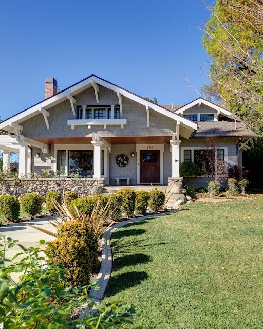
A Craftsman bungalow has large numbers, which are clearly visible from the street.
A traditional “Cape Dutch” house has plain black numbers
on its gatepost, easily visible from the street.
on its gatepost, easily visible from the street.

Halston's New York townhouse has large, modern numbers on the door — I guess it helped Liza find it when she was all coked up…

This San Francisco home sits high on a hill, and its numbers are placed over the garage door, at street level.
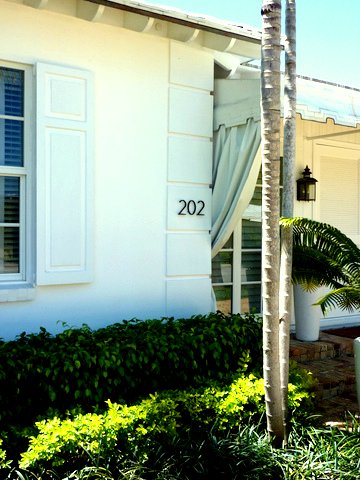
My own traditional Bermuda-style home in Florida had black, 5-inch “Neutra” numbers.

An estate-style home uses a simple wooden plaque with painted numbers.
Visible, not flashy — perfect.

Visible, not flashy — perfect.
A California contemporary home has 14-inch stainless steel numbers placed on its gate.
DISPLAYING NUMBERS CORRECTLY
The No. 1 consideration?
How far is your house from the street?
If close, smaller numbers will suffice; if it's 30 feet away, you need a 5-inch number; 60 feet away, you need 6-inch; 100 feet away, you should have them at the end of your driveway.
WHAT TYPE ON WHICH HOUSE?
FEDERAL, VICTORIAN and EDWARDIAN homes look nice with the numbers painted or etched onto the transom above the door, light fixture, or beside the door.
The numbers should be in a “period appropriate” typeface.
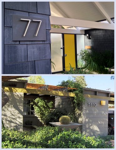
MID-CENTURY MODERN homes look best with mid-century-style numbers (duh). They can be artfully placed in vertical or horizontal positions — never diagonal.
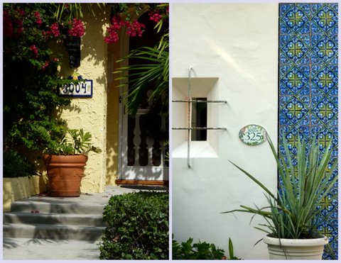
MEDITERRANEAN-style homes can use ceramic plaques, which are perfect. The problem is, those plaques usually are too small or too "decorative" to be visible from the street.

MODERN numbers look great on these traditional homes instead of that hideous Home Depot off-the-rack type. It ramps up the style a bit.

TRADITIONAL homes with large, visible numbers in practical locations— visible from the street.
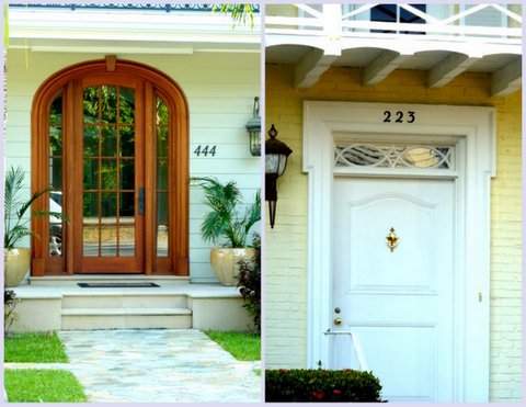
ON THE DOOR
Often, I think numbers on the door clutters up the door too much when combined with knockers, handles, keyholes, etc. But sometimes it's the right choice, like below.
ON THE DOOR
Often, I think numbers on the door clutters up the door too much when combined with knockers, handles, keyholes, etc. But sometimes it's the right choice, like below.

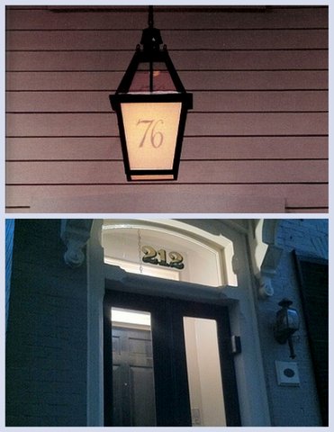
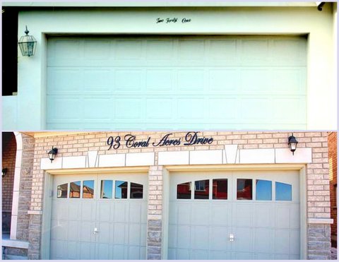
These two beautiful entrances use 6-inch numbers
well-matched to the hardware and overall aesthetic.
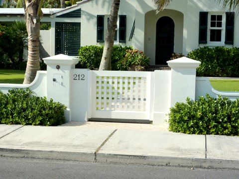
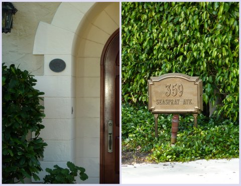
ON A PIER, PLAQUE OR GATEPOST

LEFT: The two-tone plaque is easily read
and placed where people will see it.
RIGHT: The elegant cartouche looks great and well-located, but should have the numbers darkened as it's almost invisible as is.


and placed where people will see it.
RIGHT: The elegant cartouche looks great and well-located, but should have the numbers darkened as it's almost invisible as is.
Perfect house numbers!
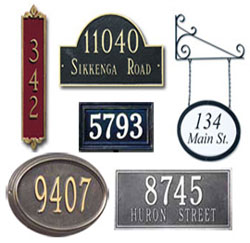
Plaques with large numbers.

Plaques with large numbers.
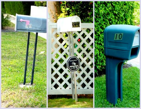
These two placards are too low and would be obscured
by any parked vehicles.

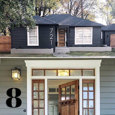
Pylons built specifically for house numbers!
TOP: 12-inch stainless steel numbers add to the mid-century style.
TOP: 12-inch stainless steel numbers add to the mid-century style.
BOTTOM: A contemporary redwood post with the stainless numbers, visible and modern.
TYPES OF NUMBERS
The good, the bad and the ugly
SCRIPT

Definitely a more elegant, but
script numbers should be written out:
One Hundred Fifty One
NOT One Fifty One
ILLUMINATED NUMBERS

These easily can go the wrong way and be really tacky.
script numbers should be written out:
One Hundred Fifty One
NOT One Fifty One
ILLUMINATED NUMBERS
These easily can go the wrong way and be really tacky.
But make sure they're legible from the street when lit and not lit, and don't make them too large, or your house will look like an all-night pharmacy.
BAD HOUSE NUMBERS
AND BAD PLACEMENT
TRUTH: All three of these heinousities belong
to multimillion-dollar homes in Palm Beach,
Dafuqizatabout?
These aluminum plaques from Frontgate |
or Restoration Hardware
are just sooo everywhere.
They're not "upscale” — they look cheap.

or Restoration Hardware
are just sooo everywhere.
They're not "upscale” — they look cheap.
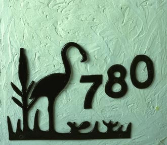
NO arts and craft projects on the front of your house, please!
These big-ass numbers look stupid.
Your objective to creating a house isn't the address.

TOP: Peel-n-stick — perfect on the vinyl siding adjacent to vinyl shutters...
BOTTOM: Obviously, a crafty cat lady made that — but can you read that from the street??

BOTTOM: Obviously, a crafty cat lady made that — but can you read that from the street??
Why waste the limited space on these plaques
with the street name?
Umm, aren't you already on that street
if you're reading the sign??
with the street name?
Umm, aren't you already on that street
if you're reading the sign??
And do I really need to tell you to NOT put your name on a yard sign — that is, unless you like identity theft.
TOP: FAIL! Really, you think that twiddly little plastic script from Home Depot is legible from the street after dark?
BOTTOM: FAIL! Huge-ass custom script lettering looks like a condominium — again, you don't need your street name.
BOTTOM: FAIL! Huge-ass custom script lettering looks like a condominium — again, you don't need your street name.
For all you big spenders, bronze is barely legible during the day, so it sure ain't legible at night...