
FIXING DECORATING DISASTERS

(Jayne Mansfield's Beverly Hills Home ca. 1959)
I've never been known to keep my opinions to myself... especially of those interiors trying to look rich or imply wealth or privileged lineage...
I thought it would be fun to share some bad examples with you and explain why they're bad as a way for you to avoid making these same mistakes.
I'm going to use the acronym
WWJD
(What Would Joe Do?)
LIVING ROOMS
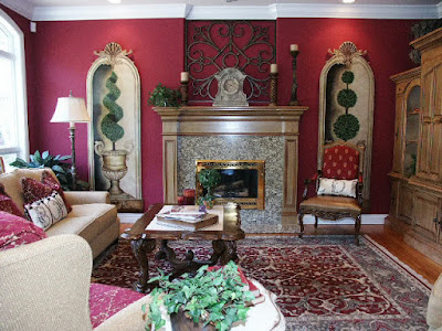
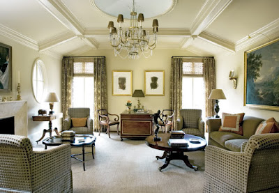
JCPenney's "Old Money Look."
But...
WWJD?
1. Paint the mantle the same color as the trim in the room.
2. Lose the two hideous tromp l'oeil niches and hang large paintings in their place.
3. Lose the rug — it's too dark and makes the room look small, not cozy. Get a beige and rusty red rug with a slight geometric pattern. The room will look bigger, smarter and less cluttered.

OMG what a view!
But...
WWJD?
1. Lose the small-scale furniture.
2. Use an "L" or arc shaped sectional facing the view.
2. Use an "L" or arc shaped sectional facing the view.
3. Use a low cocktail table.
4. Lose the Venetian blinds (drawn up in photo).
5. If sun or glare are a problem, have "3M ceramic film" installed on the windows or add soft, textural open-weave curtains. They will add texture and softness.
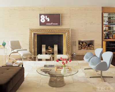
A 21st-century groove.
But...
WWJD?
1. Use a sofa in the space to "ground" all the floating pieces.
2. Pull the chair and ottoman and the two "swan" chairs closer to the cocktail table.
3. Close the audio cabinet under the bar Before taking the photo…
4. Always have a small table near seating to rest a drink, book, etc.
4. Always have a small table near seating to rest a drink, book, etc.

White on White?
But...
WWJD?
1. Have natural stained wood floors or paint the floors a pale color — this will help hide soil and create a single plane of color.
2. Accent the room with some accessory furniture in the same tones as the floor. If the "super white" scheme is preferred, pastels can add zip without being a bold statement.
3. Add interest through art or some interesting focus.
4. Add a large tree in the corner.

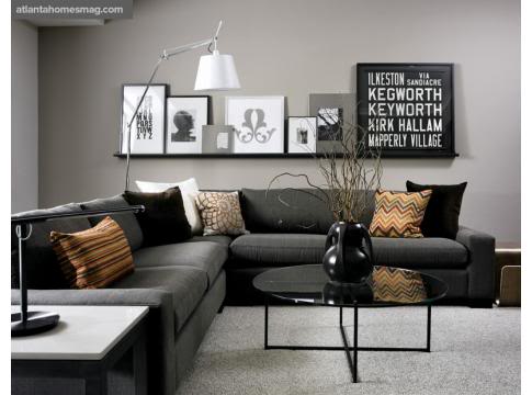
Modern shouldn't mean boring.
But...
WWJD?
1. Add a painting over the sofa with some color.
2. Use a black lacquered cocktail table.
3. Add texture; everything is too "slick." Maybe use a nubby rug, or thickly woven textiles on some pillows.

Nice chic room.
But...
WWJD?
1. Pull chairs closer to the sofa.
2. Always have a small table next to chair to rest a drink on.
3. Don't depend on ottomans as seating, they are the last choice to sit on during a party as they're not comfortable at all — especially for those over 50.
4. Place most seating within the ideal "conversation distance" of 5 feet from one person to the other.
5. Don't attempt to fill the room with furniture — that's not your goal. Your goal is to create inviting spaces.
5. Don't attempt to fill the room with furniture — that's not your goal. Your goal is to create inviting spaces.

Great windows.
But...
WWJD?
1. Rooms with lots of floor to ceiling windows need an indoor tree to blur the lines between outdoors and indoors.
2. Add a carpet.
3. Add some organically inspired things — curvy chairs or wooden pieces to make it warmer.
4. Empty rooms are not friendly rooms.
4. Empty rooms are not friendly rooms.
Nice clean lines.
But...
WWJD?
1. Add some pillows in brighter colors.
2. A groovy tree with big leaves behind the sofa in the corner would be perfect too.
3. Lose the retail "off-the-shelf" art.
4. Add a cocktail table with color.

2. Lose some of that flouncy, feminine upholstery.
3. Get some art that isn't color coordinated, that sepia-tone flower looks catalogish.
4. Have something fully upholstered in the room; everything now has exposed frames from all different periods — not good.

3. And yes, a tree is needed in the corner, too!

2. Introduce a few contemporary pieces to the room.

2. Send the five pillows back to whatever online source you found them — tassel fringe went out with the Oldsmobile.
3. If this is a foyer, a pair of beautiful old consoles would be perfect on both sides of the fireplace. Or, a pair of trees — either topiary bay or fiddle-leaf figs.
4. Add a cocktail table with color.
Nice woodwork.
But…
WWJD?
1. Add some burnt orange or French blue to make it pop, cause it ain't poppin' now...
2. Lose some of that flouncy, feminine upholstery.
3. Get some art that isn't color coordinated, that sepia-tone flower looks catalogish.
4. Have something fully upholstered in the room; everything now has exposed frames from all different periods — not good.
Good light.
But...
WWJD?
1. Use long-hanging curtain panels throughout; the London shades look stupid on one wall only. Pick one style and stick with it. Regardless whether they're doors or windows. Roman blinds on doors aren't easy to use, so all windows should've had full length curtains on poles.
2. Where's their "stuff?" The absence of tsotchkes or books makes it feel so sterile.
2. Where's their "stuff?" The absence of tsotchkes or books makes it feel so sterile.
3. And yes, a tree is needed in the corner, too!
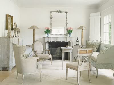
Pretty antiques.
But...
WWJD?
But...
WWJD?
1. Add a fully upholstered chair or two to anchor the room.
2. Add some books or a live plant.
3. Hang a gilt framed mirror over the fireplace — it will make the room sparkle and pop a bit more. It's very "flat" now, without any punch.
3. Hang a gilt framed mirror over the fireplace — it will make the room sparkle and pop a bit more. It's very "flat" now, without any punch.
A handsome room.
But...
WWJD?
But...
WWJD?
1. Pair the four identical club chairs in front of the fireplace.
2. Get a pair of open arm-chairs and use on either side of the sofa.
FYI: Four matching chairs in a contemporary setting looks great sometimes; in a traditional setting it looks very "lobby-like."
FYI: Four matching chairs in a contemporary setting looks great sometimes; in a traditional setting it looks very "lobby-like."
Nice decorator pieces.
But...
WWJD?
1. Short of redecorating, I'd say edit out about one-third of the stuff in this apartment which looks so old-lady 1990s.2. Introduce a few contemporary pieces to the room.
3. Lose that tacky curtain valance — they're so out and make ceilings look lower.
Nice cocktail table, pretty palette.
But...
WWJD?
1. Lose the dining chairs with the super-wide decorative pillows — it looks dumb and they are way too large to be paired with that petite settee.
2. Put a full-size sofa where the settee is and put a pair of club chairs — not dining chairs, flanking it.
3. Place the existing settee facing the loveseat, floating in the room (back to the camera). This will create a cozy seating area that is still chic and contemporary looking. The settee also adds some "patina," which makes the room less "retail" looking.
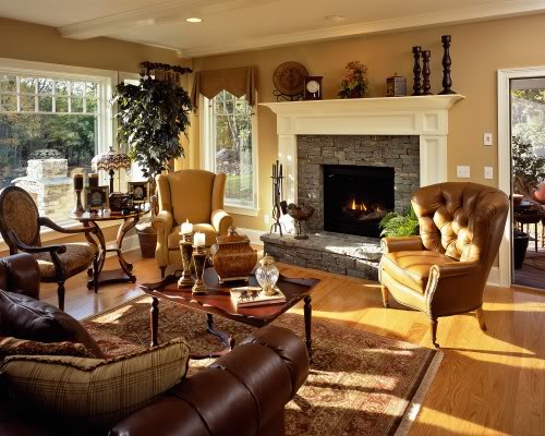
NICE fireplace and wall finish.
But...
WWJD?
1. Lose the two downmarket rattan chairs (rattan rarely looks good with metal fittings)
2. Send the five pillows back to whatever online source you found them — tassel fringe went out with the Oldsmobile.
3. If this is a foyer, a pair of beautiful old consoles would be perfect on both sides of the fireplace. Or, a pair of trees — either topiary bay or fiddle-leaf figs.
Feels fresh.
But...
But...
WWJD?
1. Never end a paint finish or wall-covering on an outside corner. The proper way is to run whatever the finish is through out the area until it is actually divided by a doorway, moulding, or another transition. If you can't afford that much paper, just paint.
2. Never end a wainscot by just dead ending it into a corner as is done here (right side of photo). It should run circumferentially around the room and die into another moulding or door casing.
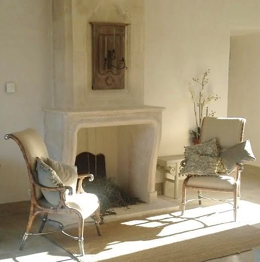
LOVE that fabric.
But...
WWJD?
1. Never use a bold or patterned fabric on something large in the room, then on one small item, it will always look like a scrap was used. If that lampshade was a simple white paper or burlap linen, it would be perfect.

Great weekend house living room.
But...
WWJD?
1. Lose the stacks of National Geographic magazines. Regular books would be better. Too many color-coordinated accents never are good.
2. Don't fill bookshelves with plates and miscellaneous junk just because you don't have books. Go to the thrift store and buy a hundred books at 50 cents each and fill the shelves, but leave room for the occasional plate or tsotchke.
FYI: In a weekend home old books are often read by guests who've forgotten their book or finished the one they brought. With 50-cent ones around, they can take one home with them and it's cool!
Large, light-filled room.
But...
2. Get a larger rug, so that no wood is exposed inside the furniture arrangement.
3. All the curtains should match in this room — why do they change for that one window by the fireplace???
4. Get a more substantial cocktail table; everything in the room is masculine and well-scaled, but that cocktail table looks flimsy.
WWJD?
1. Minimize the size of that fireplace by removing the huge mantel. Install around the stone a simple bolection moulding with no shelf.
2. Get a larger rug, so that no wood is exposed inside the furniture arrangement.
3. All the curtains should match in this room — why do they change for that one window by the fireplace???
4. Get a more substantial cocktail table; everything in the room is masculine and well-scaled, but that cocktail table looks flimsy.
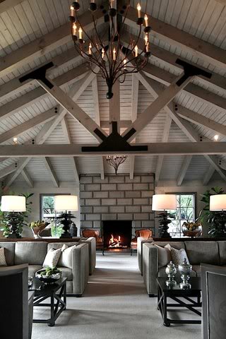
Warm colors and an architecture.
But...
WWJD?
1. Really, four seating areas??? That's just not good, it's too commercial looking for a home — not cozy at all.
2. Have some seating areas against the side walls and some perpendicular to the entrance.
3. Don't create an "aisle" through the room, move the people around, t-h-r-o-u-g -h the room.

That's a LOT of pink.
But...
WWJD?
1. Never have pieces on the diagonal, or "catty-cornered" it wastes space and doesn't add interest.
2. Paint this ceiling white!! Pink ceilings don't work unless it's a light blush or pale-pale pink and that's only for a young girls bedroom or ladies bathroom…
3. Use a softer, less bubble-gum shade of pink.
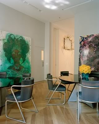
Large rooms with killer art.
But...
1. Use chairs with a simpler frame or "softer" looking.
But...
WWJD?
1. Use chairs with a simpler frame or "softer" looking.
2. Consider a large carpet that would cover most of the floor.

Beautiful wallpaper, nice antiques.
But...
WWJD?
1. Place a larger, more solid console or buffet against the wall — that demilune is too "open" and the room is cluttered with "legs."
2. Bring the four paintings in closer to the mirror and raise them slightly to "beef up" the grouping — 6" off the mirror's edge.
3. Use the Chinese chairs beside the buffet — not at the table. As it is, it makes the room look confusing.
4. Use a larger, less patterned carpet.
5. Buy a beautiful chandelier, they are ALWAYS important and that Home Depot number sprayed gold ain't working. The bottom of the chandelier should be 30" to 32" off the table top, too.
That mural is everything.
But...
WWJD?
1. To make the ceilings feel higher, mount the window shades at the bottom of the crown moulding.
2. Paint the ceiling white.
3. Lose the goofy lamps and tables on either side of the fireplace and replace with two floor lamps with solid lampshade that are not silky or see-through. Solid shades provide light furtively.
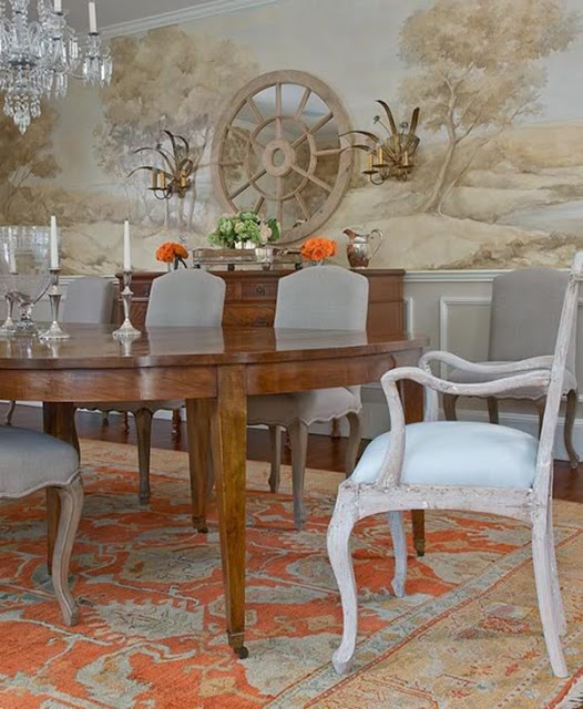
Nice colors and furniture finishes.
But...
WWJD?

1. The arms of the dining chairs don't tuck under the table top, not a crime but not great — it limits some people getting close enough to the table.
2. Get rid of that stupid "wagon-wheel" mirror over the buffet. I assume they probably didn't want to cover any of their wall mural, but there should be a huge-ass mirror or painting with a gilded frame over that buffet.
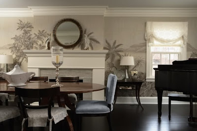
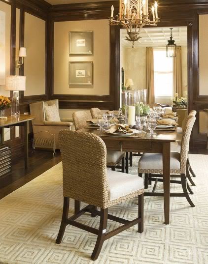
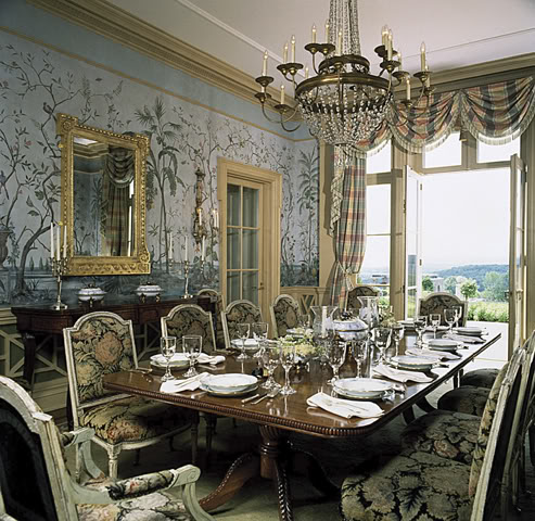
Nicely scaled dining room.
But...
WWJD?
2. There needs to be more furniture in the room, perhaps a settee under the window.
6. This room could handle two round dining tables.
7. Lose the curtains at the door — you're not at the Paris Ritz — you're in a tacky gated community.
8. Nothing on the windowsill, ever! Unless it's a plant.
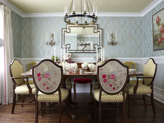
But...
WWJD?
1. Cove lighting always looks commercial, just sayin'.
2. There needs to be more furniture in the room, perhaps a settee under the window.
3. The Persian carpet is dated looking and makes the room dingy. A light colored carpet would take the pretentious edge off of the space.
4. Chairs with a less rigid design would soften the space, take away the boardroom look.
5. Some nice art on the walls would be great.
6. This room could handle two round dining tables.
7. Lose the curtains at the door — you're not at the Paris Ritz — you're in a tacky gated community.
8. Nothing on the windowsill, ever! Unless it's a plant.
Stunning room.
But...
But...
WWJD?
1. Lose the chair and magazine rack in the corner. Maybe a chair or settee in a bay window but never in the corner like that — it's goofy.
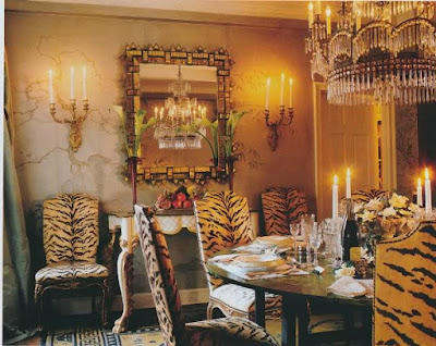
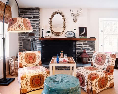
I love me some velvet tiger fabric.
But...
But...
WWJD?
1. Lose the Chinese rug; it's just too busy for this room and the bright yellow gives an odd tinge to the silver-leaf Chinese wallpaper and gilt accents.
2. The tiger velvet upholstery or the hand-painted wallpaper deserve center stage, but you shouldn't have both.
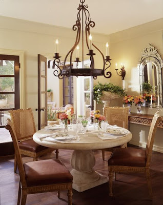
A Mediterranean room.
But...
WWJD?
But...
WWJD?
1. Get upholstered back dining chairs, perhaps casual good quality rattan chairs.
2. There are too many hard surfaces; add casual soft off-white curtain panels.
3. Add a carpet — a round sisal one would be casually chic.
A grand dining room.
But...
WWJD?
But...
WWJD?
1. I'm loving the antique white finish on the dining chairs paired with the mahogany table, but that tired-ass 1980s tapestry fabric on the chairs just totally wrong.
A beautiful "antiqued" russet colored leather or small "French" geometric pattern would've been perfect.
A beautiful "antiqued" russet colored leather or small "French" geometric pattern would've been perfect.
2. Lose the tiebacks on the curtains: Never use tiebacks — they're sooo Park Avenue 1974.
FYI: The tapestry fabric competes with the beautiful walls. ONE thing needs the be the focal point.

The circus is in town!
But…
WWJD?
Hide your kids, hide your wife, hide your husband.
But…
WWJD?
Hide your kids, hide your wife, hide your husband.
Great wallpaper.
But...
WWJD?
1. They've done something silly by installing the wainscot to coordinate with the wallpaper pattern — which makes the chair-rail wayyy too high, which makes the ceiling look low. If the wallpaper went from floor to ceiling, it would be perfect.
2. Rooms this size shouldn't have wainscoting at all, as it makes a room look small.
3. The mirror over the buffet should be vertical — never horizontal!
4. The dining chairs shouldn't be upholstered in two different fabrics, it creates visual clutter in such a small room. The room would be very pretty if the chairs were painted antique white and upholstered in the green geometric pattern — only.
BEDROOMS

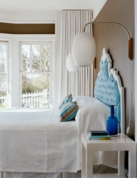
A pretty bedroom.
But...
WWJD?
1. Get a larger carpet.
2. Don't install the curtains on the face of the window casing in a bay window. They almost always should be mounted at the ceiling line.
3. Don't install curtains that look like they're from Sears Home Catalog ... swags and jabots are beyond passé.
4. Bedside wall lamps should be installed about 40" - 46" high — not 72" high as shown.
5. The ceiling should be white.
6. The chairs look cheap and uncomfortable; they're in the MBR, so they should look comfy. A white slipcover could change that easily.
7. Another color accent would complement the room; there's too much blue, which makes it boring.
FYI: Wall-to-wall carpeting is often the best in a bedroom. It helps with the acoustics and makes a room feel larger.
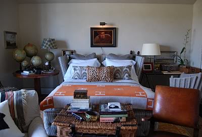
Nice collection.
But...
WWJD?
1. Layering accessories is always good but here it feels claustrophobic.
2. Clear off the bedside tables for the guests to put their own things down.
3. Take two of the pillows off the bed. Getting into bed shouldn't feel like unpacking...
Cool bed, nice mirrors and lamps.
But...
WWJD?
1. Lose the skinny legged glass topped tables. They're the wrong visual "weight" for the room. They should be solid; these look as if they ran out of money and went to Pier1.
2. Don't leave the casters on the bed exposed, especially if they're white...
3. Lose some pillows — again.

GTFO.
But...
But...
WWJD?
1. Gut this room, send it all back to that vintage store and demand your money back.
2. Never disregard the architecture when
designing a room.
3. Never have a tufted upholstered wall unless your
lithium isn't working.
lithium isn't working.
4. Never do anything like that with curtains, ever...
Great wall lights.
But...
WWJD?
1. Rethink the lights. These stick out way past the bedside tables, so you'll walk into them — do'ink.
2. Never make a bed up like that with the white bedspread tucked under the pillows unless you're at Grandma's house...

Beautiful beds.
But...
WWJD?
1. Never put beds in front of windows like that.
2. If the room is small, don't use beds with foot boards and side rails. It takes up too much room.
3. Here, upholstered boxsprings would be nice as they're clean-lined and subtle.
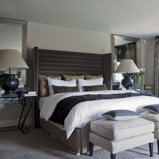
Restful room and color scheme.
But...
WWJD?
1. Get bigger, taller bedside tables; those are pretty, but the wrong scale.
2. Don't have a chair in a room if you can't move
around in the room.
around in the room.
FYI: A bedside table top should be above the top of the mattress by several inches. The reason is - if your pillow pushes over in the night or your comforter flops over it won't knock everything off the table. The room also just looks better when the tables are higher. I like them usually 30" and up, depending on the scale and height of the bed.
HALLWAYS AND ENTRIES

Gorgeous stair hall.
But...
WWJD?
But...
WWJD?
1. Add two matching consoles backed up to the stairs OR, add a console on one side and a large bench on the opposite wall.
2. Lose those two stools in the middle of the main walkway. Never create an obstacle course...
3. Add a lamp on the console so you can have soft light in the foyer — general light drifting down from two floors above looks commercial.
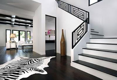
Cool house.
Cool house.
But...
WWJD?
1. Lose the zebra — you don't need a rug.
2. Lose the stupid fake "found object bottle" by the stairs.
3. Install a runner on the stairs to take away the coldness and prevent slipping accidents.
4.Use a large, contemporary center table to make the foyer look less voluminous.
5. Hire a professional.
4.Use a large, contemporary center table to make the foyer look less voluminous.
5. Hire a professional.

A large formal foyer.
But...
WWJD?
1. Remove all the existing woodwork — door casings, baseboards and crown mouldings. They're all way underscaled for the size of this room. Add larger, better quality mouldings and this room will instantly become much more elegant.
2. Get a larger table, that one is way too puny.
3. Put a carpet runner on the steps.
4. Don't have a lantern without glass, it looks low-budget.
5. Put a piece of furniture (chest) under the steps it looks "empty."
6. Lose that stupid column on the landing....
BATHROOMS
1985 on line two.
But...
WWJD?
1. Never use a self-rimming sink with a stone top. Use an "under-mount" sink.
2. Never use a "decorative" sink — they look dated immediately.
3. Paint over that hideous wall finish ASAP.
4. Don't use a cheap mirror in a powder room; your guests are too close to it and its poor quality will be obvious.
4. Don't use a cheap mirror in a powder room; your guests are too close to it and its poor quality will be obvious.
FYI: A powder room should always have the best fixtures and decorations you can afford. Reasons are: Guests are alone in there for a few minutes — so they'll have time to check things out and any low-budget stuff really obvious. After all, guests are physically much closer to the decorations in a powder room.
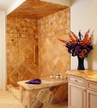
Nice stone.
But...
WWJD?
1. Be careful using a vividly patterned stone — it can get busy looking.
2. Never use 12" x 12" stone tiles — they look very "off-the-shelf" from Home Depot, regardless of what you paid.
3. Don't use all the "accessory pieces" in a tile series, it's just too matchy-matchy.
4. Don't use tumbled marble unless you live in an
ancient villa in Italy.
4. Don't use tumbled marble unless you live in an
ancient villa in Italy.
5. Keep the inside of a shower simple.
6. Don't put huge-ass silk arrangements in a bath, ever.

Nice finishes.
But...
WWJD?
1. Get rid of the grids on the shower glass! There are many nice patterns and finishes in this room, but the shower doors just put it over the edge into the clutter zone. If the doors were plain, clear glass, the room would look much bigger as the interior of the shower would become visually a part of the room.
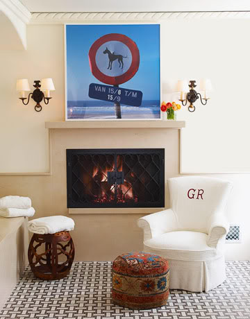
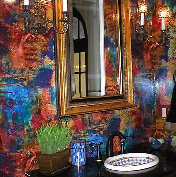
Fireplace in the bathroom.
But...
But...
WWJD?
1. Don't have upholstery monogrammed (anywhere), unless it's in a child's room, or it will look like... a child's room.
You can do it, I'm here to help!