
EXTERIOR HOUSE COLORS

CHOOSING THE RIGHT PAINT COLOR FOR YOUR HOME
In this post I will try to show you what's right and what's not right about various house colors. I'll also try to demonstrate to you that the architectural style of your home is as important as its surroundings, region and purpose when choosing the perfect color.
I have notated paint colors from the Benjamin Moore Collection, they are NOT the exact paints, but are my best estimation of what's been used, and in my opinion a good color.

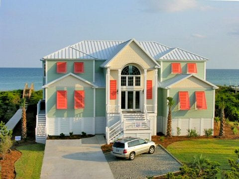
Siding: West Coast #1671 / Trim: Vermont Slate #1673 / Doors & Windows: Segovia Red #1288
OCCASIONALLY YOU'LL PASS BY A HOME AND SAY "OH WOW, WHAT A GREAT COLOR ON THAT HOUSE, I NEED TO REMEMBER THAT!"
AND THEN...

YOU RIDE BY A HOUSE AND GO "DAFUQISZAT?"
I'M HERE TO KEEP YOU FROM BEING IN THE SECOND GROUP!
I'M HERE TO KEEP YOU FROM BEING IN THE SECOND GROUP!
LET'S START AT THE BEGINNING WITH EARLY AMERICAN COLORS
In the early days pilgrims who painted their houses were considered vain and sacrilegious, but as colonies developed paint became more popular, however it was still a precious commodity and only the wealthy had painted houses.
White, the least expensive, was made from lime and oyster shells; red-oxide which is found in iron was used for red-colored paints and vivid greens came from copper oxide; blues were derived from imported indigo and local clay particles rendering it the most expensive of all colors.
Eventually paint became de rigeur... and, you know the rest of the story...

Windows: I've Got The Blues # 774 / Porch: Classic Gray #1548 / Door Umbria Red #1316
This beautiful old Virginia stone house has blue trim - a big-time status symbol in the 18th century.

Siding: Delray Gray #1614 / Door Moroccan Red #1309
This New England "Saltbox Style" has the sober tones of the pilgrims; the wood siding would've been a natural cedar weathered to gray.
Red front doors in early American times meant you had room for travelers, it was an 18th century 'vacancy sign.'
(In early American times there were no motels for travelers on horseback riding several days just to go 100 miles, so almost everyone offered travelers a meal and a bunk in their home or barn for an overnight stay hence, the saying "There's Always Room for One More").

Siding: Creamy Custard # 1145 / Door: Black
In the early 20th century when the Rockefeller's restored Colonial Williamsburg they believed the colors to be subtle and muted, but new technology has proven that wrong, they were actually quite vivid - and often hideously garish... jus sayin'.

Windows: Cumulus Cloud #1550 / Door: Tuscon Red #1300
Nantucket houses had to allow for severe weather conditions so they chose cedar siding which wasn't painted until the 20th century.

Trim: White / Door and Shutters: Black
As greater commerce began, so did in-town living. Better homes were brick as fires were very common then. One showed their individuality by their door, shutter or roof color.

In the American Southwest "Adobe Style Architecture" was used by the indigenous peoples for thousands of years; originally made with straw, sticks, manure and clay. The color was from the natural clay which was dug in the vicinity.

In the 18th century California was colonized by the Spanish Empire. The Spaniards naturally brought their "Moorish" influenced "Spanish Colonial Style" to California.
KNOW WHAT REGION YOU LIVE IN AS MANY COLORS CAN LOOK ODD IN THE WRONG LATITUDE

CLASSIC HOUSES - CLASSIC COLORS

Trim: Brilliant white.
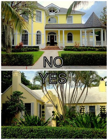
Carolyn Roehm's tastes run a little - shall we say - safe(?), but her stone "Georgian Style" home at the 42nd latitude really wears the all-white thing quite well!

Trim: White / Siding 1st floor: Alaskan Husky #1479 / Shingles 2nd floor: Half Moon Crest #1481
This American shingle-style house has the shingles painted one shade of grey and the clapboard siding below a lighter shade of grey with white trim-work - clean and classic! This combination is perfect in any region.

Trim: White / Walls: Bermuda Pink #016 / Shutters: Saybrook Sage #HC-114
When in Palm Beach you want to feel like you're in Palm Beach, riiiight ? This beautiful "Bermuda Georgian Style" home has pale "conch pink" walls with white trim and quoins, and sage-green shutters - all so tropical and handsomely subtle. These colors look a bit peculiar when they're above the 35th latitude, however.

Trim: White / Siding Dorset Gold #HC-8 / Shutters: Black
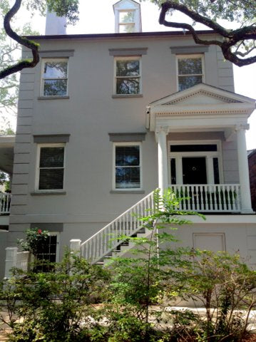
Boscobel, a "Federal Style" home built in 1804 by Englishman S.M. Dyckman who's desire was to be considered "a conspicuously well-fixed farmer surrounded by objects of taste." He had the wooden siding painted a medium gold-ish color (popular on European palaces). The pure white trim and black shutters definitely give the house a regal tone. Fine for any region.

Trim: Layfayette Green # HC-135 / Door: Essex Green
This great American "Shingle Style" home with rich green trim and naturally seasoned shingles is a centennial classic.
The deep colors will appear 'heavy' below the 35th latitude.

Siding and trim: White / Shutters: Black
This makes my shorts tight, crisp white for this "Italianate Style" is absolute perfection. The Greeks realized the deeper the carvings and details the more the shadows would help define the details - not paint. Perfect for any region too!

Walls: Vivid Peach #025 / Cornice: Tudor Brown
These "Spanish Eclectic" style homes of the early 20th century have license to be brighter as it would be true to its Mediterranean/Moorish origins.
You can't paint a Georgian-style home, or one in the upper latitudes this color - it would look like pure caca!

Trim: White / Shutters: Black / Door: Ashen Tan #996
I love brick with the paint worn off, its such a hard-to-achieve look that it's rarity is what makes it special. This "Georgian Revival" home keeps it crisp and classic with black shutters. Perfect for any latitude.

Trim & Sliding: White / Shutters: Graystone #1475
This charming "Low Country Style" home has simple, humble lines. The medium gray shutters compliment the lead-colored roof. Brighter colors would make it look cheap and feminine. A nice palette for any zone.

Trim: White / Siding: Waynesboro Taupe #1544 / Shutters: Black
This "Federal Style" townhouse was brought up-to-date by saying hell-no to "traditional" colors and using taupe with black shutters, handsome! Nicer for northern light, looks muddy in southern light.

Finally, a new McMansion playing itself down!
The trim colors, doors and dormers are all painted a soft pale taupe to blend in with the stone. The architecture is bold enough that it doesn't need any more 'accents'.

Trim: White / Siding: Cornsilk #198 / Shutters: Sabre gray #1482
In Lambertville, NJ this charming "Italianate Style" uses soft yellow and medium gray; it's old fashioned looking and not brash - which is what you want after all...
Nice in any climate.
CLASSIC HOUSES ~ UPDATED COLOR

Trim: Bone White / Shutters: Deep Ocean; 2058-30
This stunning Main Line estate is considered "French Eclectic" and in keeping with the style they've used Brittany Blue as the accent color - it's just freekin' perfect!
Would work in any latitude.

Trim: Linen White / Shingles: Webster Green #HC-130
This shingle style home has an unusual, 'leafier' green with off-white trim. It needs to surrounded by trees and no lower geographically than the 35th latitude, otherwise it will look peculiar, it's not a warm weather color scheme.

Trim: White / Shingles: Silver Mist #1619 / Shutters: Sea View #836
This gray-painted shingle home with the pale blue shutters is lovely, perfect for a seaside or southern climate, but too soft above 40th latitude.

Trim: White / Siding: Tudor Brown
This updated "Tudor Style" has knocked it out of the park with the dark espresso for the siding and crisp white for windows.
Northern climes only, above 40th latitude!

Trim and Siding: Moccasin #1059 / Shutters: Baja Dunes 997
Ma and Pa Kettle have moved up to the big farm in the sky, and Ernie and Roberto have zhuzhed up the old place with putty and taupe!
pretty cool, right?
Oddly, these colors aren't right for the tropics, probably best above the 30th latitude in the east, but great in the southwest.

Trim: White / Gables: Breath of fresh Air #806 / Siding: Landscape #430
A Neoclassical home in fern green? Yup, and it looks good anywhere too! Notice the gables painted the palest gray/blue...

Trim: White / Siding: Silver Lake #1598 / Door and windows: Graphite #1603
This little farshtunken cottage gets the "wow" prize by using an elegant dove gray with graphite and white trim. Playful colors would've made the house look more feminine and downmarket.
Any latitude too!

Walls: White / Windows: Hearthstone #1601 / Shutters: Black
A 70's 'French Eclectic' style home is made cleaner and crisper by painting the brick pure white and using gray trim with black shutters.
Any latitude.

Trim: White / Siding: Cobblestone Path #1606
An "American Stick Style" home is also made to look more elegant and less flashy with medium gray siding, white trim and black shutters. I'd prolly not do this in the tropics or below the 30th latitude.
HAVE A LITTLE FUN WITH COLOR
(But don't get stupid!)

Trim & Accents: Chrome Green / Siding: White
Th purest American style home with the most old-fashioned color scheme is perfection. The green trim makes it pop and have some character.

Yellow: Golden Orchards #329 / Red: Ryan Red #1314
This black brick contemporary house is totally brought alive with the bright red and yellow.
How boring would that be with gray accents.. wayyy, right?

Trim & Shingles: White / Shutters: Old Glory #811
A shingle-style home at the seashore painted pure white with bright blue shutters is perfect for the beach, but maybe a tad garish for Bloomfield Hills...

Trim: White / Siding: Alphano Beige #989 / Windows and door: Garrison Red #HC-66
The 'mode' in Victorian times was to have the window frames dark and the mouldings around lighter. This cranberry, white and taupe combo freshens up the old style whilst being respectful of the architecture.

Horizontal Siding: Deerfield #1159
Instead of the ubiquitous all-white, this contemporary home used shades of brown and taupe to create a softer, 'approachable' modern home.

Main House: Blue Diamond #736 / Wall: Island Sunset 1346 / Door: Yellow Rain Coat #2020-40
In tropical climates brighter colors rock, but DON'T GET CARRIED AWAY!
They should be used with careful thought and coordination.
When using colors like this ALWAYS try them all out - together - on the surface you're painting before you buy 40 gallons as paints have an entirely different look in the natural daylight than they do in a fluorescent-lit paint store.

Trim: White / Windows: Blue Marguerite #2063-50
This typical shingle style cottage gets snappy using blue trim to coordinate with the bluestone porch.
It's also accented well with the pillows and blue lobelia in hanging baskets.

Stucco: Sandy Brown #1046 / Windows: Wethersfield Moss #HC-110 / Band around door: Golden Bounty #294
It's hard to see - but this Spanish "Mission Revival Style" home in Palm Beach has a 'goldenrod' color band around he door which makes the entry pop against the old wooden door. The shutters are natural wood with sage green window trims...soft and sophisticated.

Trim: White / Siding: Forget Me Not #2049-60 / Shutters and Porch Ceiling / Suntan Yellow #2155-50
A clapboard house gets a little zhuzhed up with some ramped-up color - pale turquoise-blue and butter-colored shutters.

Shutters: Great Barrington Green HC-122
I love these tones of sand and olive with the mahogany trim.

Trim: White / Shutters: Waterfall 2050-50
People rarely use teal or any of the aqua-tone colors well on their exterior, but I think this is quite elegant! It's quiet, yet different enough to make impact!

Trim: Black / Stucco: Saint Martin Sand #2164-50
From Florida to California these small Spanish Colonial style homes are usually painted white, pink or some boring shade of cream. Take a chance, do something more interesting...

Trim: White / Windows & Door: Black / Shutters: Arizona Tan #2162-50
Typical Mid-sixties colonial in the 'burbs had its common red brick painted white; the window frames were painted black and the shutters a super chic cafe-au-lait color.

Trim: White / Lower Siding: Sweet Vibrations #391 / Upper Siding: Sweet Pear #389
One thing you must remember is...it's only paint!
If you tire of it, it's not forever. I love a bold statement like these bright leafy greens on this very plain American Stick style house.

Trim Color: Opaline #OC-33 / Siding and Panels: Dolphin's Cover #722 / Shutters: Southern Vine #2138-20
This soft blue with cream trim is a calm, tasteful combination, but combined with the brown shutters it's a huge hit!

Siding: Coral Buff #024 / Windows: Peacock Feathers #724 / Shutters: Dolphins Cove #722
In Boca Grande, Florida I stumbled across this adorable cottage. Everything is a bold shell pink (house and trim) but what makes it rock is the blue-gray window trim and the pale blue-gray 'washed' cypress shutters. It's funky - in a very sophisticated way!
Trim: White / Siding: Van Alen Green #HC-120 / Shutters: Monticello Peach #018
Pale sage green siding with cream gables and white trim are nice and subtle, but those coral shutters make it pop and give it some life.

Trim: White / Shingles: Courtyard Green #546 / Doors and Windows: Country Redwood
If you're daring and secure, a color-scheme like this could turn your boring-ass shingle place into something very special.
(no cojones = no fun...!)

Trim: White / Siding: Clay #1034 / Shutters: Dorset Gold #HC-8
Often bright colors on cottage-style homes can make them look feminine or just plain silly. I think this Australian home is handsome and cozy with the toast siding and honey colored shutters.

(This is all vinyl product)
The average new home today often uses too many 'accent colors' to make it look all new and shiny - is that what you really want? Here the taupe and greige tones are pulled from the stone making the house quiet and handsome.

Trim: White / Shingles: Duxbury Gray #HC-163 / Doors: Concord Ivory #HC-12
Another small bungaloid is turned into a charming English'y looking cottage with some lattice and cool marigold color doors!

Trim: White / Lower Siding: Herb Garden #434 / Upper Siding; Kennebunkport Green #HC-123 /
Doors and Windows: Country Redwood
There's a lot going on here, but it works. The quiet greens are popped up with small touches of the red trim.
Too much accent color is a crime and will be punished by the aesthetic police to the fullest extent of the law!
(But don't get stupid!)
Trim & Accents: Chrome Green / Siding: White
Th purest American style home with the most old-fashioned color scheme is perfection. The green trim makes it pop and have some character.
Yellow: Golden Orchards #329 / Red: Ryan Red #1314
This black brick contemporary house is totally brought alive with the bright red and yellow.
How boring would that be with gray accents.. wayyy, right?
Trim & Shingles: White / Shutters: Old Glory #811
A shingle-style home at the seashore painted pure white with bright blue shutters is perfect for the beach, but maybe a tad garish for Bloomfield Hills...
Trim: White / Siding: Alphano Beige #989 / Windows and door: Garrison Red #HC-66
The 'mode' in Victorian times was to have the window frames dark and the mouldings around lighter. This cranberry, white and taupe combo freshens up the old style whilst being respectful of the architecture.
Horizontal Siding: Deerfield #1159
Instead of the ubiquitous all-white, this contemporary home used shades of brown and taupe to create a softer, 'approachable' modern home.
Main House: Blue Diamond #736 / Wall: Island Sunset 1346 / Door: Yellow Rain Coat #2020-40
In tropical climates brighter colors rock, but DON'T GET CARRIED AWAY!
They should be used with careful thought and coordination.
When using colors like this ALWAYS try them all out - together - on the surface you're painting before you buy 40 gallons as paints have an entirely different look in the natural daylight than they do in a fluorescent-lit paint store.
Trim: White / Windows: Blue Marguerite #2063-50
This typical shingle style cottage gets snappy using blue trim to coordinate with the bluestone porch.
It's also accented well with the pillows and blue lobelia in hanging baskets.
Stucco: Sandy Brown #1046 / Windows: Wethersfield Moss #HC-110 / Band around door: Golden Bounty #294
It's hard to see - but this Spanish "Mission Revival Style" home in Palm Beach has a 'goldenrod' color band around he door which makes the entry pop against the old wooden door. The shutters are natural wood with sage green window trims...soft and sophisticated.
Trim: White / Siding: Forget Me Not #2049-60 / Shutters and Porch Ceiling / Suntan Yellow #2155-50
A clapboard house gets a little zhuzhed up with some ramped-up color - pale turquoise-blue and butter-colored shutters.
Shutters: Great Barrington Green HC-122
I love these tones of sand and olive with the mahogany trim.
Trim: White / Shutters: Waterfall 2050-50
People rarely use teal or any of the aqua-tone colors well on their exterior, but I think this is quite elegant! It's quiet, yet different enough to make impact!
Trim: Black / Stucco: Saint Martin Sand #2164-50
From Florida to California these small Spanish Colonial style homes are usually painted white, pink or some boring shade of cream. Take a chance, do something more interesting...
Trim: White / Windows & Door: Black / Shutters: Arizona Tan #2162-50
Typical Mid-sixties colonial in the 'burbs had its common red brick painted white; the window frames were painted black and the shutters a super chic cafe-au-lait color.
Trim: White / Lower Siding: Sweet Vibrations #391 / Upper Siding: Sweet Pear #389
One thing you must remember is...it's only paint!
If you tire of it, it's not forever. I love a bold statement like these bright leafy greens on this very plain American Stick style house.
Trim Color: Opaline #OC-33 / Siding and Panels: Dolphin's Cover #722 / Shutters: Southern Vine #2138-20
This soft blue with cream trim is a calm, tasteful combination, but combined with the brown shutters it's a huge hit!
Siding: Coral Buff #024 / Windows: Peacock Feathers #724 / Shutters: Dolphins Cove #722
In Boca Grande, Florida I stumbled across this adorable cottage. Everything is a bold shell pink (house and trim) but what makes it rock is the blue-gray window trim and the pale blue-gray 'washed' cypress shutters. It's funky - in a very sophisticated way!
Trim: White / Siding: Van Alen Green #HC-120 / Shutters: Monticello Peach #018
Pale sage green siding with cream gables and white trim are nice and subtle, but those coral shutters make it pop and give it some life.
Trim: White / Shingles: Courtyard Green #546 / Doors and Windows: Country Redwood
If you're daring and secure, a color-scheme like this could turn your boring-ass shingle place into something very special.
(no cojones = no fun...!)
Trim: White / Siding: Clay #1034 / Shutters: Dorset Gold #HC-8
Often bright colors on cottage-style homes can make them look feminine or just plain silly. I think this Australian home is handsome and cozy with the toast siding and honey colored shutters.
(This is all vinyl product)
The average new home today often uses too many 'accent colors' to make it look all new and shiny - is that what you really want? Here the taupe and greige tones are pulled from the stone making the house quiet and handsome.
Trim: White / Shingles: Duxbury Gray #HC-163 / Doors: Concord Ivory #HC-12
Another small bungaloid is turned into a charming English'y looking cottage with some lattice and cool marigold color doors!
Trim: White / Lower Siding: Herb Garden #434 / Upper Siding; Kennebunkport Green #HC-123 /
Doors and Windows: Country Redwood
There's a lot going on here, but it works. The quiet greens are popped up with small touches of the red trim.
Too much accent color is a crime and will be punished by the aesthetic police to the fullest extent of the law!
LOCATION SPECIFIC COLORS

Trim: White / Stucco: Cucumber #428
Pale pastels are super for tropical southern locales or island locations. In northern climes pastels look like special-ed classroom colors. Pastels should be used below the 35th latitude.

Trim: Stain / Shingles: Beach Glass #1564
Natural tones for rural, woody beach or country locations.
Any latitude.

In the desert regions house colors should be respectful of their environment and blend into the landscape - not draw attention.

Siding: Narragansett Green #HC-157
Deep grays, dark green or browns help a house blend into the landscape. Pacific northwest, New England, Mid-Atlantic, etc.

Trim: White / Siding: Million Dollar Red #2003-10
Barn red is fun in country locations, wooded lots or New England seaside regions, but NOT on suburban houses in gated communities.

Stucco: Juno Peach #087 / Windows: Peale Green #HC-121 / Soffit and Door: Tudor Brown
Sandy-peachy pastels are great for warm regions, the tropics and arid areas. Carefully consider the style of home as well because they're perfect for Mediterranean stucco homes but goofy on a center hall colonial in Richmond.

Stucco: Golden Orchids #329
A tropical home in colorful Brazil looks great with the bright yellow accent wall. But, that same style home in Montecito or Park City would look like someone used leftover paint from the Sunoco station.

Trim: Kennebunkport Green #HC-123
Beautiful! Natural stucco with sage green blends beautifully into glade'y or woody areas. But, it would look horribly artificial at the beach or in a gated community.

Trim: White / Shingles: Blue Macaw #784
This bright blue is perfect for a seaside home or a house in the Norwegian Fiord's but will look pure nouveau-riche white-trash in Indian Hill!

Trim: Candy Green #403 / Siding: Sour Apple #401
Pastels and brights combined are good only for cottages, seaside homes, and elementary schools!
Otherwise you'll look like the eccentric cat lady...

Trim: White / Stucco: Peach Cobbler #2169-40 / Shutters: Black
In sultry New Orleans this bright salmon gives this architecturally unfortunate house some snap, but anywhere else it would look like a set for "My Cousin Vinny".
Trim: White / Stucco: Cucumber #428
Pale pastels are super for tropical southern locales or island locations. In northern climes pastels look like special-ed classroom colors. Pastels should be used below the 35th latitude.
Trim: Stain / Shingles: Beach Glass #1564
Natural tones for rural, woody beach or country locations.
Any latitude.
In the desert regions house colors should be respectful of their environment and blend into the landscape - not draw attention.
Siding: Narragansett Green #HC-157
Deep grays, dark green or browns help a house blend into the landscape. Pacific northwest, New England, Mid-Atlantic, etc.
Trim: White / Siding: Million Dollar Red #2003-10
Barn red is fun in country locations, wooded lots or New England seaside regions, but NOT on suburban houses in gated communities.
Stucco: Juno Peach #087 / Windows: Peale Green #HC-121 / Soffit and Door: Tudor Brown
Sandy-peachy pastels are great for warm regions, the tropics and arid areas. Carefully consider the style of home as well because they're perfect for Mediterranean stucco homes but goofy on a center hall colonial in Richmond.
Stucco: Golden Orchids #329
A tropical home in colorful Brazil looks great with the bright yellow accent wall. But, that same style home in Montecito or Park City would look like someone used leftover paint from the Sunoco station.
Trim: Kennebunkport Green #HC-123
Beautiful! Natural stucco with sage green blends beautifully into glade'y or woody areas. But, it would look horribly artificial at the beach or in a gated community.
Trim: White / Shingles: Blue Macaw #784
This bright blue is perfect for a seaside home or a house in the Norwegian Fiord's but will look pure nouveau-riche white-trash in Indian Hill!
Trim: Candy Green #403 / Siding: Sour Apple #401
Pastels and brights combined are good only for cottages, seaside homes, and elementary schools!
Otherwise you'll look like the eccentric cat lady...
Trim: White / Stucco: Peach Cobbler #2169-40 / Shutters: Black
In sultry New Orleans this bright salmon gives this architecturally unfortunate house some snap, but anywhere else it would look like a set for "My Cousin Vinny".

Stucco: White / Trim and Windows: Tudor Brown
White stucco is my favorite for Spanish Colonial and Mediterranean style homes - it always looks good, doesn't fade and works in any climate.
COLORS FOR SPECIFIC ARCHITECTURE
VICTORIAN & QUEEN ANNE
There's this whole "Painted Lady" mindset about Victorian houses where people want to paint them as if they're some sort of lascivious boardwalk attraction. The Victorians ONLY painted houses in deep, rich tones, NEVER in pastels. As trends moved on everyone painted their darkly painted homes white or cream.
Below are examples of good Victorian and Queen Anne
and then some bad ones...


These homes below look like Gypsy wagons!
The prim and proper Victorians would have never painted their homes to look like this.

"STICK" and ARTS & CRAFTS STYLE
In 'the period' they were most often painted white as they were middle-class housing in those days. These below have taken some liberty and painted them to add interest and fun.
Again, cottages can be more playful in their coloration's.
(but remember, crazy cat lady is one shade away)

BEAUX-ARTS STYLE
Almost always white, cream or putty with the window frames often painted a dark color.

REVIVAL STYLES
(Italian, Greek, Mission)
A true 'Italian' revival like below should actually be painted with a "wash" not a solid color to make it look worn and old.
The Italian city of Rome requires you paint buildings with a tempera-like paint so it will fade and look old immediately!

CLASSIC GEORGIAN STYLE
Would have almost always been painted a shade of white or sandstone color to match the real stone work.

TUDOR STYLE HOMES
Some are absurd looking while others can be handsome and stately.
This beautifully restored granite home below has all the window frames painted black which offsets the stone and simplifies the overall look.
One HUGE mistake people make with Tudor style is they use too many accent colors. Originally, on wooden Tudors there would be two colors; the white painted stucco and the brown half-timbers... period.

These below have taken some liberties with successful results; dark grays, sage greens, sandstone, terra-cotta and white.
Again - the winning formula is ONE accent color and dark window frames.


These below have taken too much liberty and used too many accent colors, ugly color choices or white window frames.

COLOR CAN TRANSFORM A CLARK KENT HOUSE INTO A SUPERMAN HOUSE!

The average American 1940's suburban home is ramped up with moss green, tan and brown. Its quiet, tasteful and blends into the landscape.

A basic American 'stick-style' shotgun house is made happy with a lot of white trim, creamy yellow siding and shiny green shutters.

A normal 'Cape Cod Style' house looks amazing because they painted the red brick taupe to match the cedar roof, and 'crisped it up' with white and black accents.
(Red brick makes small houses look even smaller, paint the brick to increase its presence).

Out in the middle of no-freekin-where this Italian Revival farmhouse rocks it out! The bright chartreuse green with the crisp white trim and fuchsia door is brilliant.
(Pity about that unfortunate picture window, right??)

This plain-Jane rancher in Palm Beach was taken from tear-down status to fun mid-century 'wow' with a few changes: White painted brick, pale taupe stucco and the lime green front door.
Isn't that stucco faux-drapy-curtain-thing over the door awesome?
I love it.

In Savannah Georgia, another clapboard house on another old square gets a shout-out for being brighter than the rest, and it works! The periwinkle blue with black shutters is just enough but not too much!

A 'Sears & Roebuck Bungalow' in Cambridge, Maryland was probably white its entire life until someone took a chance, and it's great. The three shades of sage with the chocolate brown windows makes this plain home stand out on a street of uninteresting houses.
(A little landscapin' wouldn't hurt)

This little townhouse in London would look like a shit-hole if painted white. But someone with some 'brass' took a chance and it's not tacky or garish, it's fun and charming!
Now for the first time in its modest life has some character!

An ordinary home in Charlotte becomes more interesting with fern green walls and white trim. The ubiquitous gray, white or tan would be super boring because the house doesn't have very interesting architecture. Interestingly enough, I think shutters would be too much.
Less is always more.

How many of these horrible "70's modern" houses have we seen in a dried out brown, weathered stain?? This black stain makes it cool and updated.

A boring ranch house has been made way more interesting with the addition of the dormers and front stoop. The bad 70's brick was painted too which helps a lot.

A Folk Victorian Style home in soft sage with deeper sage is much more interesting than white with pine green shutters!
GETTIN' THE 'SHADE' RIGHT

Oh Dorothy, I saw this peach-beige villa on my trip to Venice and I'm gonna paint my house that color, won't it be nice? NO.
(Suggestion: A Good peach color / Sunlit Coral #2170-60)

Your home should never look like the inside of a swimming pool, ever...
(Suggestion: A good light blue / Morning Sky Blue #2053-70)
Butter yellow not margarine yellow.
(Suggestion: Two good yellow colors are; Traditional Yellow #170
and Lemon Sorbet #2019-60)

That old pine green from the 1950's is just so bad.
Try Benjamin Moore's "Essex Green" instead.

This new brick home has all the trim in the same moleskin color taken from the brick; it all blends harmoniously, I love it.

Never mix cream-base paints with white-based paints.
As you can see this is a very 'clear' white-based blue color, but that deep cream trim is nasty - it should be bright white.

That color is a bit too 'fecal' for my senses...
A deep camel or terra-cotta would've been much nicer... indeed.
A nice 'big-boned' home in Savannah was been painted dove gray with deeper gray accents - it doesn't work. The high humidity in the region makes everything look gray so the grays come off blah. Homes in high humidity areas (except seashore) pop more with tan/taupe/white based paints than gray based paints.
Also this home needs some extras to make it more interesting like awnings or window-boxes.

Who picked THAT out?
Vivid bright colors almost always look horrible on traditional homes.

Wait 'til they go to sell that house...

The deep putty colored trim was drawn from the stone colors, and it looks good also on the patio furniture too.
Too many accent colors are bad, especially with a busy stone or brick pattern.

Often all one color is very cool!
Monochromes work when they're on architecturally interesting houses.

NICE AND APPROPRIATE COLOR
CHOICES ON THESE HOMES


DETAILS, DETAILS, DETAILS
Why are those rafter-tails painted brown? This isn't a Mediterranean home (which is the only style home that should ever have brown rafter-tails!)

Don't highlight the horrible glued-on Styrofoam 'architectural details,' play them down, make them blend in.

Looks like the storm window order got messed up.

These people got slap-happy with the accent colors!
This house depends too much on the colors for decoration, they should balance it all with some interesting landscaping.

The bones of this house are great! But they need a few 'adjustments.' They've made the (too skinny) dormers stand out with all the contrast painting; and the overall color scheme is blah.

Many lower-priced replacement windows only come in white; try to work white into your scheme - otherwise you wind up with these glaring white windows - regardless how sophisticated your color scheme is...

This house has too many 'highlighted' details. The architecture is good, but someone thought it was cool to highlight every detail with contrasting paint colors.
A: The half-spindles (balustrade) and the background should be all white.
B: All of the moulding details encircled in 'B' should be white - but the outside square columns (behind the 'A') should be the yellow.
C: Can be either white or yellow color.

This 18th century townhouse in Georgetown, DC has a thin wash of white paint to give it an aged/peeling look, which I LOVE!
However, it needs a punch of color - either the front doors or some colorful landscaping to replace the dead boxwood's...
Never paint the window frames in an 18th century home another color from the sash, that is a Victorian style.

This old house has a three-color scheme; the two shades of gray and then the camel accents works well. The porch ceiling is always a nice place to put a contrasting color too.

This looks like it should be the home of Alexander Julian...
The colors are fun, but there's just too many of them
A: The half-spindles (balustrade) and the background should be all white.
B: All of the moulding details encircled in 'B' should be white - but the outside square columns (behind the 'A') should be the yellow.
C: Can be either white or yellow color.
This 18th century townhouse in Georgetown, DC has a thin wash of white paint to give it an aged/peeling look, which I LOVE!
However, it needs a punch of color - either the front doors or some colorful landscaping to replace the dead boxwood's...
Never paint the window frames in an 18th century home another color from the sash, that is a Victorian style.
This old house has a three-color scheme; the two shades of gray and then the camel accents works well. The porch ceiling is always a nice place to put a contrasting color too.
This looks like it should be the home of Alexander Julian...
The colors are fun, but there's just too many of them
PAINTING TIPS and VERNACULAR

Don't be cheap, the labor costs are about the same, so use higher quality paint; it requires fewer coats and will last much longer, eventually saving you money down the road.
Consider purchasing an oil or latex paint in a flat/matte or satin finish. These types of paints will endure extreme weather conditions, can be customized to your specific climate, and are ideal for painting siding or brick.
I personally prefer the siding and trim to be in a latex or oil 'satin finish' with the doors and shutters in a 'high-gloss' oil base enamel.
I ALWAYS specify Fine Paints of Europe's "HOLLANDLAC" on shutters and doors as there is no finer paint in the world. It gives the surface a perfectly smooth lacquered look which lasts for years.
Click here for tips for painting your exterior "BY REGION" from Benjamin Moore Paints
You can do it, I'm here to help!